Wednesday 6th March,
This day was spent in the library at Hereford College of Arts researching, I found some extraordinary works in order to draw inspiration from for my project.This research I will be displaying within my sketchbook in order to keep an in depth log throughout, also putting the work into my sketchbook means it will be accessible to me at all times!
I have now began to build up a wide variety of references and practitioners, this will be very helpful in aiding me through my work. My research into artists' work is mostly focusing on the mystical but also quite dark connotations of their work. I feel this is inspiring my greatly and the reflection upon each individual artist's work will be shown in my sketchbook along with samples of their work.
I have began researching my topic in great depth also, I have decided to research the topics of Paganism, Wicca, Shamanism, Black Magic and Angels/ Healing. All of these topics broadly link into Paganism and Practical magic, they are also the areas that I feel most enthusiastic about studying as they are very personal to me. I am a firm believer in the effects of magic and healing, I also think it is important to take notice of the five great elements of our world, something which Paganism is centred around.
Thursday, 14 March 2013
Tuesday, 5 March 2013
Chakra Edit Test!

Chakras!
Chakras also fall into the study of modern witchcraft and healing. The Seven chakras in our body are where the energy flows through. It is believed that blocked energy in any of the seven chakras can lead to illness. I believe chakras are an important part of everyday life as people often forget about taking care of their body throughout their busy schedules. The belief of chakras allows people to find inner peace with their body and to understand what's right and what isn't for it. Having clear chakras is believed to keep a clear perception on life and our surroundings.

This diagram shows where the chakras are located within the body, each different colour represents a different chakra, each chakra is believed to have a different purpose within the body.
Red: Root Chakra: This is believed to be at the base of the spine, and it is the centre for our survival issues such as; food, money and financial security.
Orange: Sacral Chakra: it is believed to be in the lower abdomen, this is the place where our sense of abundance, well being and pleasure is centred and dealt with.
Yellow: Solar Plexus Chakra: is believed to be in the stomach area, it is our control centre for our self-confidence and self- esteem.
Green: Heart Chakra: is located within the chest, it controls our feelings of love and inner peace.
Blue: Throat Chakra: is located in the throat and is our ability to communicate and express the truth.
Lilac: Third Eye Chakra: is found in the forehead, between the eyes, it is believed to control our ability to focus and our perceptions of our surroundings.
Purple: Crown Chakra: is located at the very top of the head, it controls our feelings of sprituality and our connections with higher spirits.

This image above shows the different symbols which are used to represent different chakras. From Left to Right: The Root Chakra, The Sacral Chakra, The Solar Plexus Chakra, The Heart Chakra, The Throat Chakra, The Third Eye Chakra, The Crown Chakra.
I really like the structure of these symbols and I feel they could work really well within my photograph edits. I will move on to trying to include these symbols into my edits.
Sunday, 3 March 2013
Witchcraft!
Given that the majority of my project is focused around witchcraft, I decided to create a couple of images based on this idea. The image below was created by first duplicating the original photograph. I altered the contrast on one layer in order to get the very black outline, I then added a green hue to the other layer and changed the opacity level. I then laid each individual word over in order to change the colour of the text according to the different points in the photograph. I feel this is a very effective image and is very bold and eye catching. I think the darkness and the green hue perfectly suggest witchcraft.

From this image, I then created the image below. The image which I have layered over the top is St. Briavels castle. I find it very beneficial to explore the landscapes and old buildings within my local area in order to exploit them and make the most of my art project. I feel the image of the castle works very well layered over the witch image, the atmosphere of the castle, which towers very high and looms over the village, is very haunting. I changed the contrast and saturation of the castle image in order to darken it; I feel this works very well over the witch image as it is all very dark and quite ominous.

The image below was created from an earlier image which I edited, I simply layered some text over the top of it. I feel this image works well though as it is very dark and the dark makeup and wooded area behind suggests witchcraft; many witchcraft movies are based within wooded areas of land. I focused in on this when I created the below image. The position of the text works well as it is directly across the centre of the image.

Wiccan Symbols in Editing!
When researching Wiccan Symbols, I decided to add a few into my images whilst editing in order to see how they could work with the images.


Wicca!
A large part of practical magic originates from Wiccan traditions, for this reason, it will be very relevant within my studies during part 3. I think the important part of this research is discovering the varying traditions within Wicca and how they have lead on to the modern magical world. A particular interest of mine is the symbolism within Wicca.
2) http://aesobolwillowshade.files.wordpress.com/2012/08/wiccan-symbols.jpg?w=640
1)

2)

Above are two examples of the sorts of symbols used within Wicca, I feel most are creative and will work well with my photographs when I edit them.
1) http://www.lunasgrimoire.com/wp-content/uploads/2012/07/symbols11.gif2) http://aesobolwillowshade.files.wordpress.com/2012/08/wiccan-symbols.jpg?w=640
Friday, 1 March 2013
A couple of Crystal edits!
From my photographs of my crystals, I decided to create a couple of edits using them in order to see how effective they were.

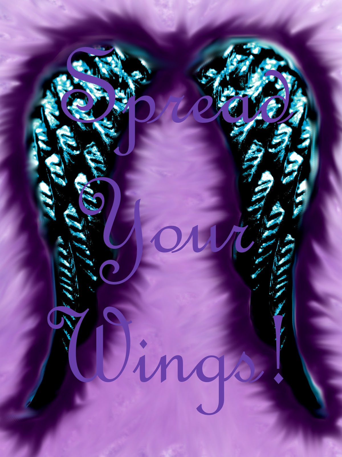
I created these angel wings from a necklace pendant, I lowered the saturation of the photo and then increased the contrast, this took away the silver jewellery look of the pendant. The pendant is only one angel wing so I had to duplicate and reverse the image in order to create the pair. I feel this effect works well and creates and more realistic pair of angel wings.


Crystals!
Crystals and crystal healing have become very important to me within the last two years, I felt that I wanted to incorporate these into my project too. I have a small collection of crystals, so i began to photograph these with the intention of incorporating them into future photo edits. I have included a few of the photos which I took of my crystals.


Amethyst.

Snowflake Obsidian.

Malachite.

Flourite.

Smoky Quartz.

Bloodstone.

Fluorite Angel.

Sodalite Dowsing Crystal.

Green Fluorite.
Cat photo edits!
After the success of my cat makeup shots, I then decided to edit these in order to make the most of the images I had created.


Project related photos!


Practice Photo Shoot!


Part 3 Proposal
I began Part 3 by creating my proposal for the project. At first I was unsure where to begin to look for ideas so I took to the popular website Pinterest. On here I was able to find all sorts of inspiration, I also decided to look back in my life over the last twelve months and find out what was important to me. The factor that stood out for me was paganism and practical magic. I find this is of interest to me as I feel it is something which I can really connect with, going through alot in my life, I sought to find something to believe in which could be constant in my life. I collect crystals and oracle cards so I felt this would be a good place to begin. With the basis that my project would be based on objects which I collect, I have also decided to base my project mostly around photography as I feel this would be the best way to incorporate objects and found items into my work.
Once I had decided my topic matter and set my proposal, I began my research and brainstorming!
Once I had decided my topic matter and set my proposal, I began my research and brainstorming!
Subscribe to:
Comments (Atom)